


AN AMAZING BAKERY
25 August, 2026LIEVIE already has a lot going for it. The brand has a distinctive character, carefully selected coffee, handmade ceramics, coffee alternatives, matcha and, perhaps most importantly, a story built around curiosity, craftsmanship and people. The products themselves have personality, and the physical experience of LIEVIE feels like something worth discovering.
The opportunity was to bring that same feeling into the digital experience. The existing shop had all the ingredients, but they weren't always working together as one clear journey. Products, brand story, coffee shops and the people behind LIEVIE could each have a stronger role in helping visitors understand what makes the brand different and what they should do next.
My approach was therefore not to simply give the website a visual refresh. I wanted to rethink how the shop communicates, how people discover what suits their taste or simply what they might like and how the different parts of the LIEVIE story connect. After all, not everyone is a coffee specialist and not everyone knows exactly what they are looking for when they visit a specialty coffee shop — or its online store. The experience has to guide them, teach them and give them a reason to care.
Without that story, a coffee can easily become just another specialty coffee. The goal was to create a digital experience that helps people understand the difference, discover what fits them and move naturally from identifying a need to making a purchase while still preserving the character and warmth that make LIEVIE what it is.
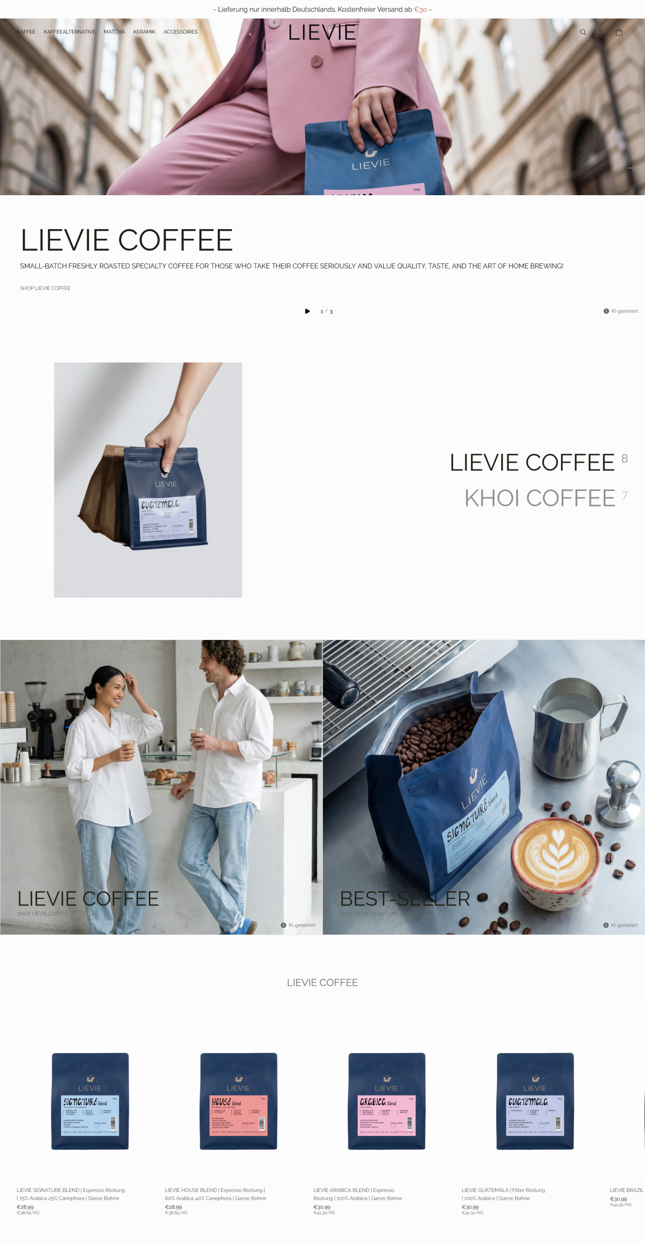
→ What it is:
The current website uses an image carousel that primarily communicates information about the different types of coffee available. However, the CTAs are very small and can easily be mistaken for regular text within the banner, making it unclear that they are interactive elements.
In addition, the first 6–8 scrolls are dominated by repetitive visual content, making the experience harder to navigate and scan. Instead of progressively building a picture of the brand and guiding the user towards the next step, the homepage largely repeats the same message.
At first glance, the message comes across as: “Want good coffee? We have good coffee.”
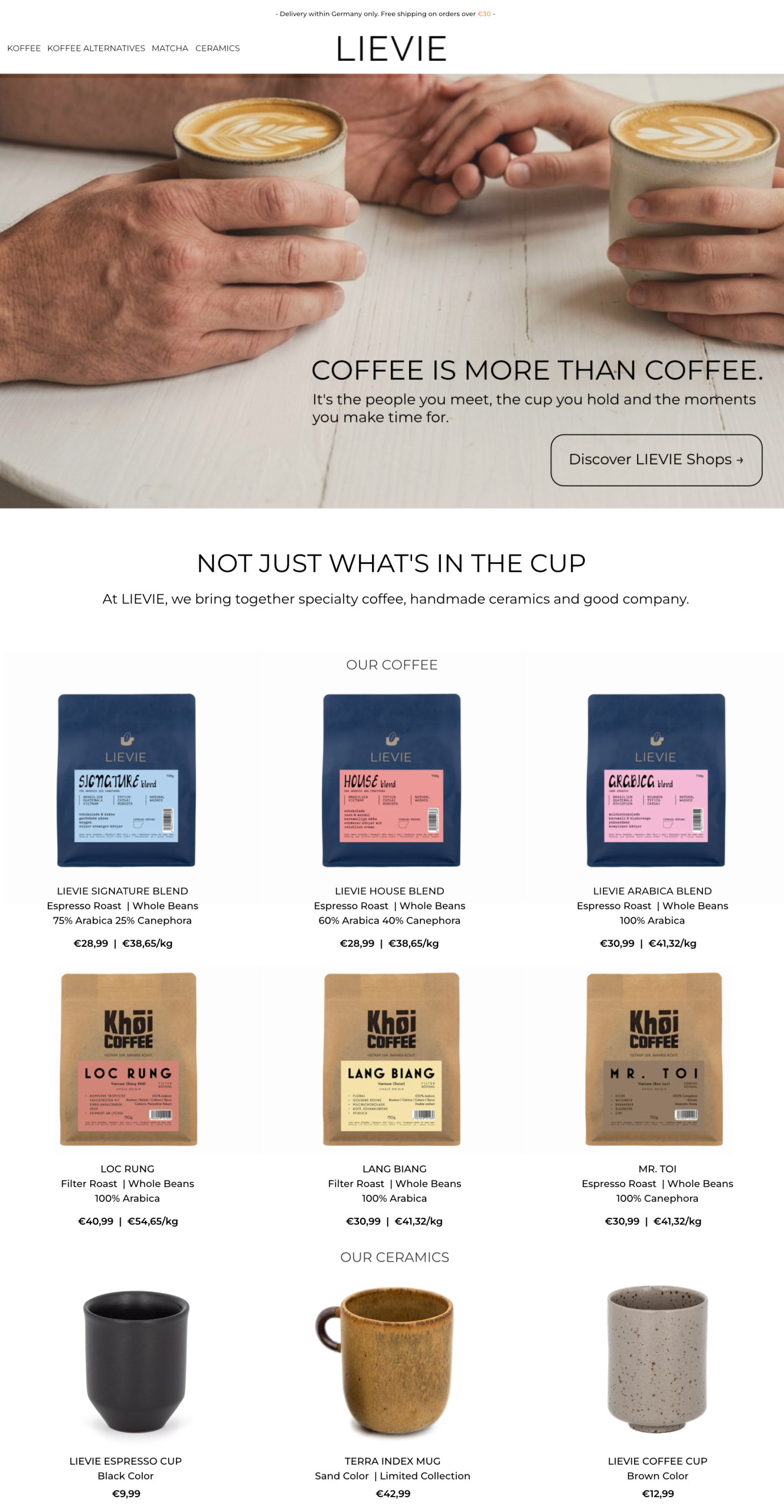
★ What I did:
- ✓Made the LIEVIE logo and navigation more prominent, so they remain clearly visible instead of getting lost against the hero imagery;
- ✓Simplified the hero message to communicate that LIEVIE is about more than just coffee, while using a clear and visible CTA to guide visitors towards discovering the coffee shops, community and story behind the brand;
- ✓Kept the product selection focused, presenting a curated range of coffee bags alongside a small selection of handmade ceramics. Rather than overwhelming visitors with too many choices, I wanted to create enough variety to spark interest while keeping the decision-making process simple;
- ✓Presented coffee and ceramics as part of the same experience, rather than treating them as separate product categories;
- ✓Created a clear visual and content hierarchy that moves naturally from the LIEVIE experience to coffee and then into handmade ceramics.
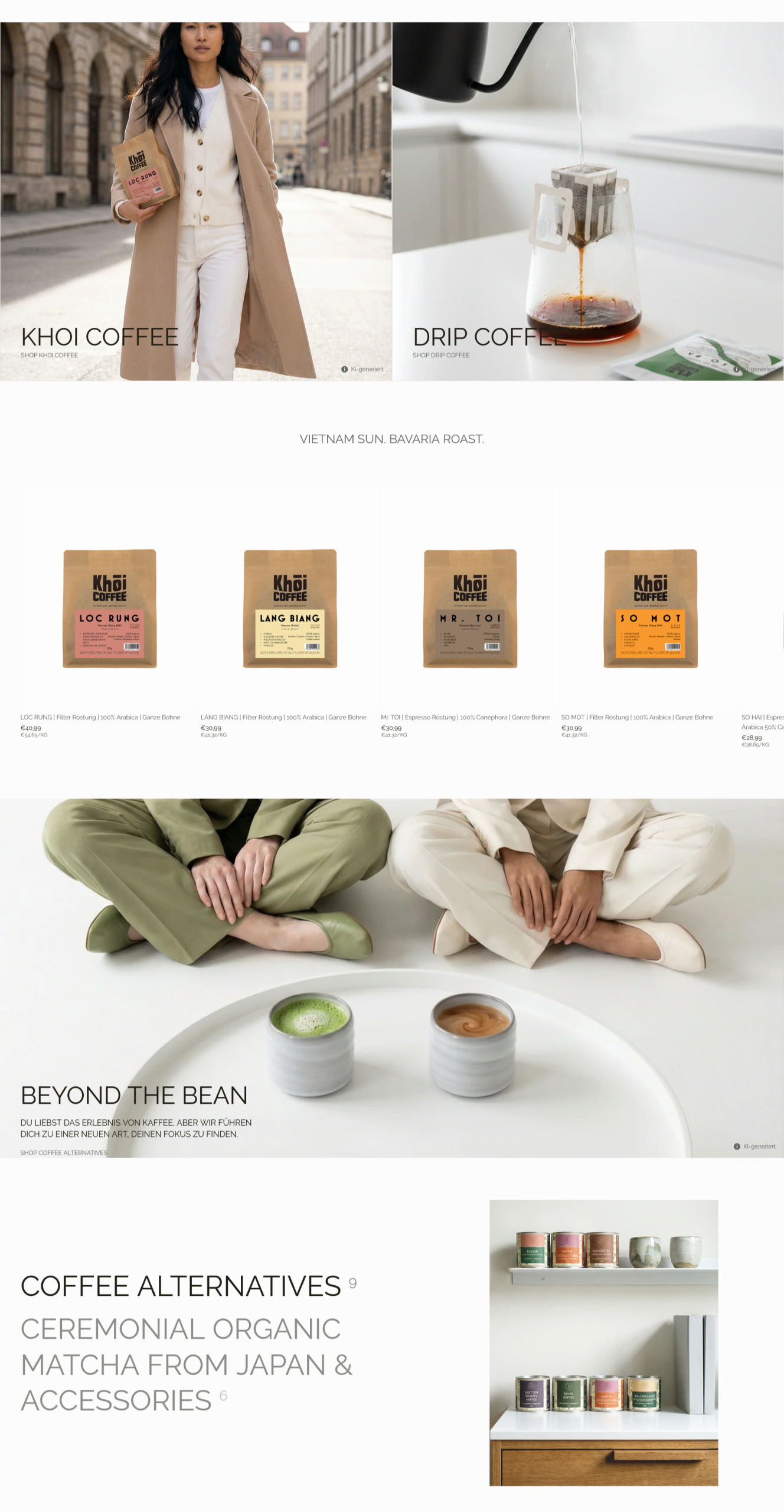
→ What it is:
The current website continues the homepage with two banners promoting Khoi Coffee and Drip Coffee, both leading visitors to other coffee-focused sections. These are followed by a selection of Khoi Coffee products and, further down, a “Beyond the Bean” banner. The CTAs across these banners are quite subtle and can easily go unnoticed.
After “Beyond the Bean”, the website introduces two more CTAs. One leads to the same destination as the “Beyond the Bean” banner, while the other follows a very similar direction, eventually leading visitors towards accessories and matcha.
As a result, the experience becomes repetitive and the different paths start to overlap, making it less clear what else LIEVIE has to offer and where each CTA is actually taking the visitor. More importantly, the website doesn't really try to guide visitors based on where they are in their journey. It mainly presents links and expects users to decide which one to click, rather than helping them understand what might be relevant to them next.
By the time a visitor has scrolled down six or eight times, they are already at a different stage of the decision-making process. If they have already been shown coffee-focused banners and products and haven't engaged with them, simply presenting more links to other coffee-related sections is unlikely to move the experience forward. At that point, they may need more context, guidance or a different way to discover what LIEVIE has to offer.
The opportunity was therefore not simply to add more products or more links, but to make the website respond to the visitor's needs — helping them understand their options, discover what suits them and find an alternative when coffee isn't what they're looking for.
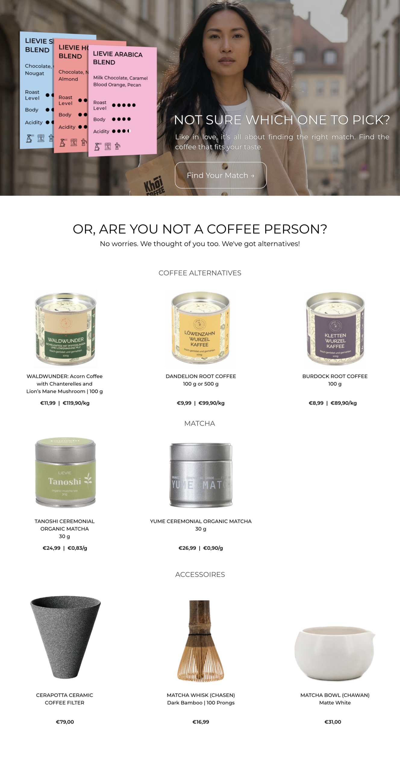
★ What I did:
- ✓ Replaced the repetitive coffee-focused banners with a “Not sure which one to pick?” section, giving visitors who are not coffee specialists a simple way to discover what might suit their taste instead of expecting them to choose from a list of products.
- ✓ Turned product discovery into a guided experience, using characteristics such as roast level, acidity, body and flavour notes to help visitors understand the differences between the coffees and make a more informed choice.
- ✓ Introduced “Or, are you not a coffee person?” as a second path, recognising that someone who has already passed through several coffee-focused sections without finding something appealing might be looking for something completely different.
- ✓ Added coffee alternatives, matcha and accessories, giving these visitors a clear next step instead of another coffee-related link and showing that there is more to LIEVIE than coffee.
- ✓ Kept the selection focused and easy to scan, rather than presenting every available product. The goal was to offer enough options to encourage exploration without recreating the same choice overload found elsewhere on the page.
- ✓ Created distinct paths based on visitor needs, replacing the previous overlapping CTAs with a journey that helps people either find the right coffee or discover something else they might enjoy.
→ What it is:
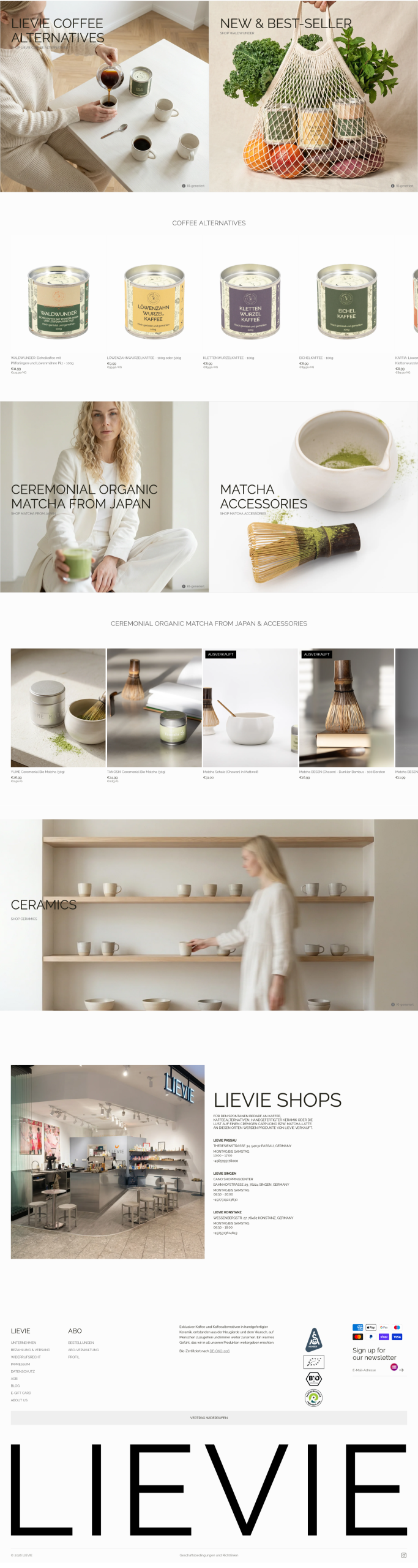
The current website continues with another banner dedicated to coffee alternatives, using the same subtle CTA treatment as the previous sections, followed by a selection of coffee alternative products. The homepage then moves into two more banners, this time promoting ceremonial matcha and matcha accessories, followed by products from both categories.
Further down, another banner introduces the ceramics collection, before the homepage finally moves into a section about LIEVIE’s coffee shops, including their locations and addresses. The page then ends with the footer.
As a result, the homepage gradually turns into a long sequence of banners and product collections, with each new category introduced in almost the same way. Coffee alternatives, matcha, accessories and ceramics all receive their own banners and product sections, but there is little distinction between their roles within the overall experience. Instead of feeling like a carefully structured journey, the page starts to feel like a catalogue where one category simply follows another.
There is also a missed opportunity to use the later stages of the homepage to reinforce what makes LIEVIE different. By this point, a visitor has already seen coffee, alternatives, matcha, accessories and ceramics. Rather than continuing to introduce products in the same format, this part of the page could bring the different elements together and answer a more important question: why LIEVIE?
★ What I did:
- ✓ Significantly shortened the homepage, removing the repeated banners and product sections that had already been addressed earlier in the journey. Rather than making visitors scroll through the same types of content again and again, I wanted the homepage to become more focused and intentional.
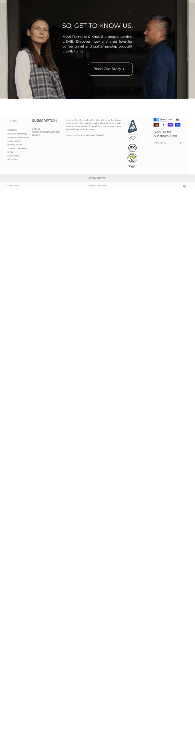
- ✓ Introduced a “So, get to know us” section as the final content section before the footer, using the LIEVIE story to give visitors a better understanding of the brand behind the products.
- ✓ Used the LIEVIE story as a final opportunity to build connection and drive conversion, especially for visitors who have already scrolled through the coffee, coffee alternatives, matcha and accessories but have not found a product that convinced them to buy. At this point, the decision may no longer be about finding the right product. Understanding what LIEVIE stands for, where it comes from and what makes it different could be the element that makes the brand itself worth choosing.
- ✓ Reduced visual and content overload, avoiding a homepage filled with banners, product grids and repetitive sections. The goal was to make the experience easier to navigate and less tiring while also reducing unnecessary content that could contribute to longer page load times and a less efficient overall website.
- ✓ Created a clearer overview of what LIEVIE represents, bringing the different elements of the brand together without forcing visitors to keep scrolling through every category individually.
The Bigger Picture
The goal of this revamp was not to add more content, more products or more ways to click. It was to make the existing LIEVIE story easier to understand and easier to navigate.
I was fully aware that this website is, first and foremost, a shop and I approached the redesign with that in mind. But a shop should not simply function as a catalogue of products. It should also create reasons to convert — building trust, communicating value and giving visitors a reason to choose the brand behind the products.
For LIEVIE, that meant moving away from a long sequence of promotional banners and product categories and creating a more intentional flow: introduce the brand, help visitors find the right coffee, offer alternatives when coffee is not what they are looking for and finally give them a reason to connect with LIEVIE itself.
The result is a shorter, more focused homepage where each element has a clearer purpose and the products are supported by the story behind them. Ultimately, the goal is not just to help someone find a product. It is to give them enough reasons to want to buy it from LIEVIE.